In Chemung County, a homeowner whose property sold for $40,000 pays 72% more
in property taxes per dollar of actual value than a homeowner whose property
sold for $300,000. This is not an accident. It is the direct result of a frozen
assessment roll.
The Simple Version
Before the charts and the ratios, here is what is actually happening.
The county has to decide how much every house is "worth" so it knows how much
to charge in property taxes. An assessor sets those values. Whatever number
the assessor puts on your house — that's what you pay taxes on.
The assessor in Elmira hasn't really updated those numbers in a long time.
When houses actually sell, we find out what they're really worth —
because a real person paid real money for them. So we can compare: what did
the assessor say the house was worth versus what did someone actually
pay for it?
Here's what the data shows. Cheap houses — the ones in the
struggling neighborhoods, selling for $30,000 or $40,000 — are assessed at
more than people actually paid for them. Those owners are paying
taxes on value that doesn't exist. Expensive houses are
assessed at far less than what people paid. Those owners get a big discount.
The result: a family in a $40,000 house pays 72% more in
property taxes per dollar their home is actually worth than a family in a
$300,000 house. Same tax system. Very different deal.
Why? Because houses in nicer neighborhoods went up in value over the years,
but the assessor never updated the numbers to keep up. The cheap houses in
struggling neighborhoods didn't go up in value — so their numbers stayed
roughly accurate. And it gets worse every year that the roll stays frozen.
The Assessment-to-Sale Ratio
When a property sells, we can compare what the assessor said it was worth to
what a willing buyer actually paid. That ratio should be close to 1.0 for a
fair assessment. In Chemung County, it isn't — and the gap is not random.
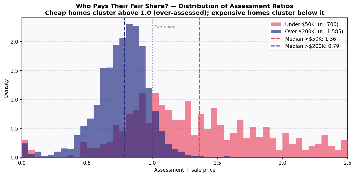
1.36Median ratio — homes under $50K assessed at 136% of sale price
0.43Median ratio — Elmira homes $125–150K assessed at 43% of sale price
0.79Median ratio — homes over $200K assessed at 79% of sale price
1.72×Tax burden gap — cheap vs. expensive per dollar of actual market value
A ratio above 1.0 means the assessed value exceeds what the property actually
sold for — the owner is paying taxes on phantom value. A ratio below 1.0 means
the property is under-assessed — the owner pays less than their share. In a fair
system, both would cluster near 1.0 regardless of price. In Chemung County,
cheap homes cluster above 1.0 and expensive homes cluster below it.
This analysis uses 6,491 arm's-length single-family sales
recorded in Chemung County between 2018 and 2025. Arm's-length sales are
transactions between unrelated parties at fair market value — foreclosures,
family transfers, and quitclaims are excluded. The data comes from the New York
State ORPTS SalesWeb system.
The J-Curve
Plot assessment ratio against sale price and a pattern emerges: over-assessment
at the bottom, under-assessment in the middle, partial recovery at the top.
The shape is consistent with what researchers find in cities across the country
that haven't reassessed in decades.
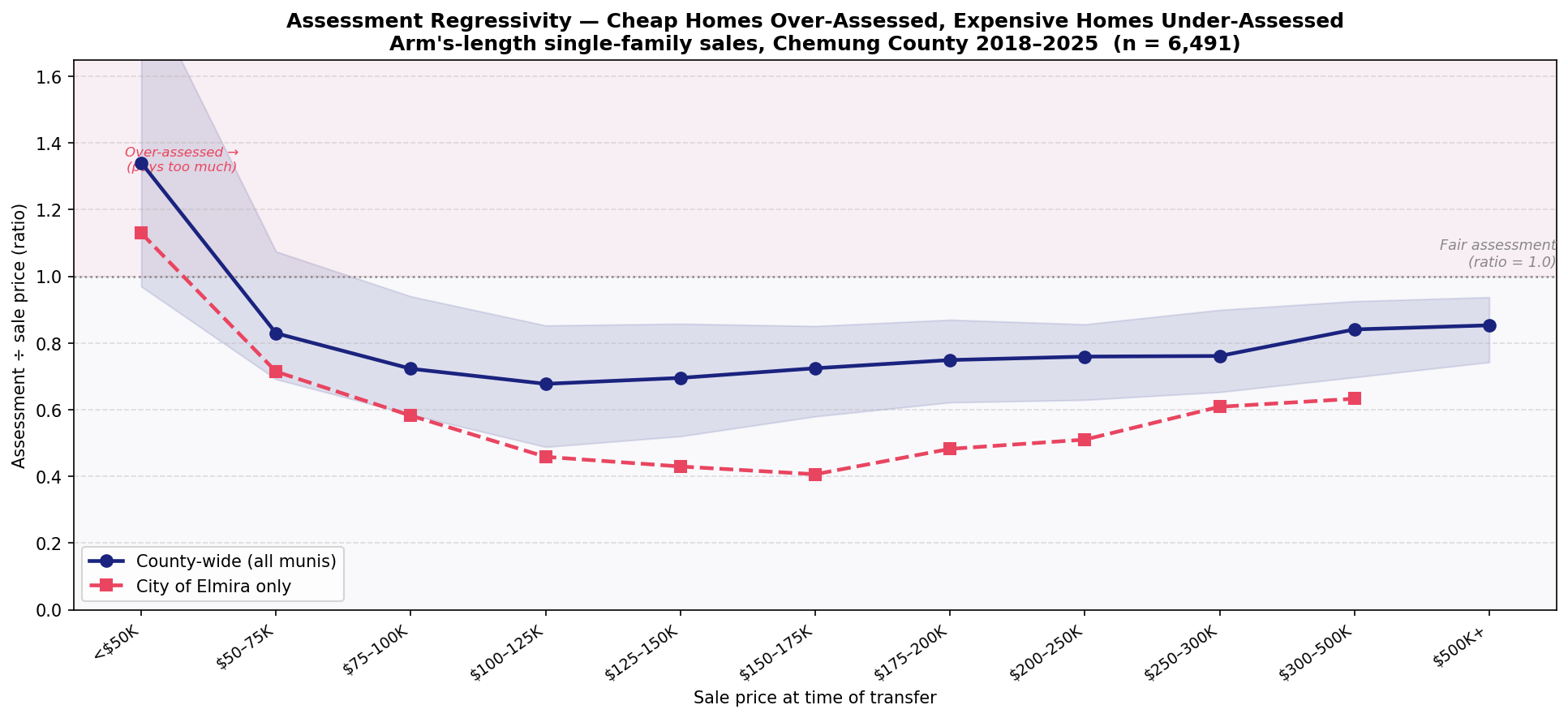
The county-wide J-curve shows the cheapest homes — those selling under $50,000 —
carrying a median ratio of 1.36. These are the houses in the most distressed
neighborhoods, the ones most likely to be owned by people with the least
political power and the least ability to appeal their assessments. They are, on
average, paying property taxes on value that does not exist.
The City of Elmira's curve is steeper. An Elmira home that sold for $125,000
to $150,000 carried a median assessment ratio of 0.43 — assessed at less than
half its actual market value. The frozen assessment roll has allowed decades of
market appreciation to go uncaptured in Elmira's tax base while leaving the
cheapest properties stuck near their assessed values, which haven't fallen
as fast as the neighborhood conditions that drove prices down.
The mechanism is straightforward: when a city stops reassessing,
assessments drift away from market values at different rates in different
neighborhoods. Neighborhoods that have appreciated (even modestly) see their
assessments fall further below market. Neighborhoods that have declined see their
assessments stay closer to — or exceed — actual value. The result is a transfer
of tax burden from appreciating areas to declining ones, which in Elmira means
a transfer from wealthier to poorer households.
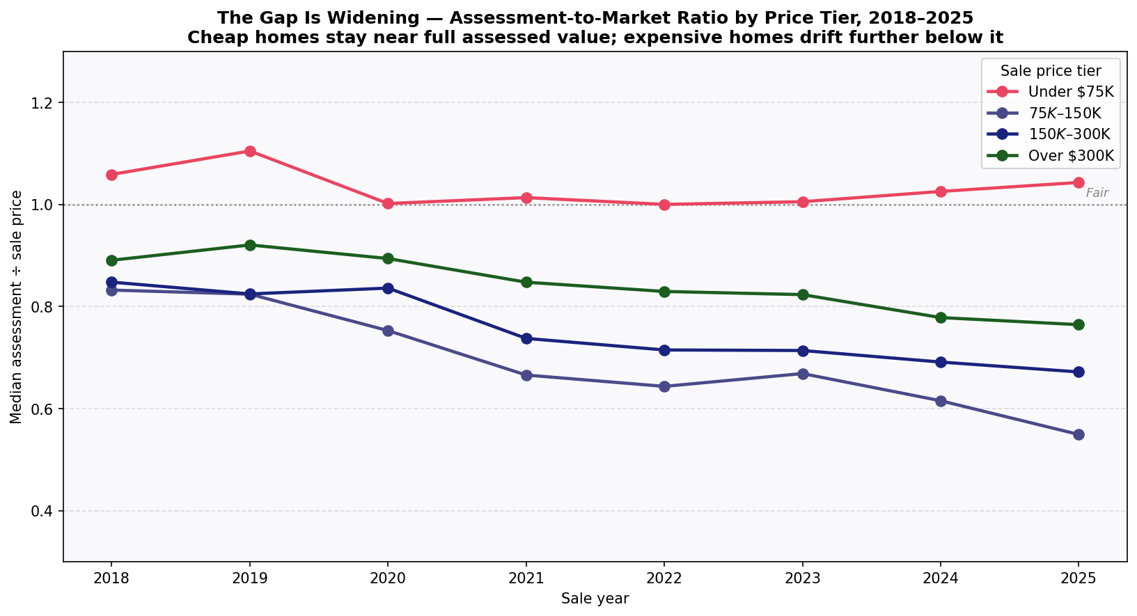
The Gap Is Getting Worse
Year-by-year data from 2018 to 2025 shows the assessment ratio for mid-range
and expensive homes falling steadily while the ratio for cheap homes stays near 1.0.
Without reassessment, this trend continues indefinitely.
In 2018, a home selling in the $75,000–$150,000 range carried a median ratio
of about 0.83 — assessed at 83% of market value. By 2025, that same price range
had a median ratio of 0.55. The gap between cheap homes (ratio holding near 1.0)
and mid-range homes (ratio falling year over year) has nearly doubled in seven years.
This is what happens when a housing market moves and assessments don't. Post-pandemic
home price appreciation hit Chemung County the same way it hit the rest of the
country — median sale prices for arm's-length single-family transactions climbed
significantly between 2020 and 2024. The assessment roll didn't follow. The result
is an ever-larger subsidy for properties that have appreciated, paid for by
properties that haven't.
The only corrective is reassessment. The equalization rate adjustment the state
applies — which produced the apparent jump in Elmira's "full value" figures in
2023 — adjusts how the state measures the roll for aid and apportionment
purposes. It does not change a single property's assessed value. No one's tax
bill changes because of the equalization rate. Only a actual citywide reassessment
resets individual assessments to current market value.
Elmira Specifically
The city's regressivity pattern is sharper than the county average —
and the stakes are higher, given the city's poverty rate and tax burden.
Among the 1,699 arm's-length single-family sales recorded in the City of Elmira
between 2018 and 2025, 17.7% involved a property assessed at
more than its sale price. These are predominantly in the lowest price tiers —
homes under $50,000 — in the city's most economically stressed neighborhoods.
The households in those homes are disproportionately renters (whose landlords
pass property taxes through in rent) or low-income owners who have limited
options to appeal or move.
Meanwhile, properties at the middle and upper end of the Elmira market are
dramatically under-assessed. A home selling for $130,000 in Elmira in 2024
typically carried an assessed value under $60,000. The owner pays taxes on
$60,000 worth of property while living in a $130,000 house. The effective tax
rate per dollar of actual value is less than half what a neighbor in a $40,000
assessed property pays.
This is not a story about the rich avoiding taxes. Most of these properties are
modest working-class homes. The regressivity isn't driven by mansions being
under-assessed — it's driven by an entire housing market appreciating away from
a frozen assessment roll, unevenly, in ways that happen to follow income and
neighborhood lines.
Assessment regressivity is not unique to Elmira. It has been
documented in Chicago, Detroit, Philadelphia, and dozens of other cities with
infrequent reassessment. The pattern is consistent enough that the academic
literature calls it a structural feature of low-reassessment systems, not
administrative error. The Chemung County data fits the pattern precisely.
Charts
Three views of assessment regressivity: the J-curve shape, the trend over time,
and the distribution of ratios at the top and bottom of the market.
All data: arm's-length single-family sales, Chemung County 2018–2025 (n = 6,491).
The J-Curve — Assessment Ratio vs. Sale Price
County-wide (blue, with IQR band) and City of Elmira only (red dashed).
The horizontal dotted line is a fair assessment (ratio = 1.0). Properties
above the line are over-assessed; below it, under-assessed. Elmira's curve
is steeper across nearly every price tier.
The Widening Gap — Ratio Trends by Price Tier, 2018–2025
Cheap homes (red) hold near 1.0 while mid-range and expensive homes drift
further below fair value each year. The gap between the cheapest and most
expensive tiers has nearly doubled since 2018.
Who Pays What — Distribution of Ratios
Cheap homes (red, under $50K) cluster above the fair-value line; expensive
homes (blue, over $200K) cluster below it. The vertical dashed lines show
the median for each group — a 72% gap in effective tax rate per dollar
of actual value.
What Changes This
Reassessment. That is the only mechanism that corrects assessment regressivity.
When a city reassesses to current market value, every property's assessed value
is reset to reflect what it would actually sell for today. The ratio distribution
tightens around 1.0. The effective tax rate per dollar of value equalizes.
Reassessment is often described as a tax increase on long-time homeowners — and
for some it is, if their neighborhood has appreciated. But the framing obscures
what's actually happening: under the current system, those same long-time
homeowners have been receiving a subsidy, paid by their neighbors in cheaper
properties who have been over-assessed. Reassessment doesn't raise taxes — it
reallocates them to reflect actual values.
The Elmira page models what citywide
reassessment would mean for the distribution of assessments and who would see
their bills change. The Why It Matters page
explains why reassessment hasn't happened despite the evidence, and who benefits
from the status quo.
Method: 6,491 arm's-length single-family (class 210) sales in
Chemung County, 2018–2025, from NYS ORPTS SalesWeb (data as of May 2025). Each sale's
assessment-to-sale-price ratio = assessed value ÷ sale price. Sales below $10,000 and
ratios above 5.0 are excluded as likely data errors or non-market transfers. The
headline gap compares the median ratio for sales under $50K (1.361) with sales of
$200K or more (0.790): 1.361 ÷ 0.790 ≈ 1.72×, i.e. 72% more tax per dollar of value.
The regressive pattern this measures is well documented in the assessment literature
(e.g. Berry 2021 on Chicago; Avenancio-León & Howard 2022).